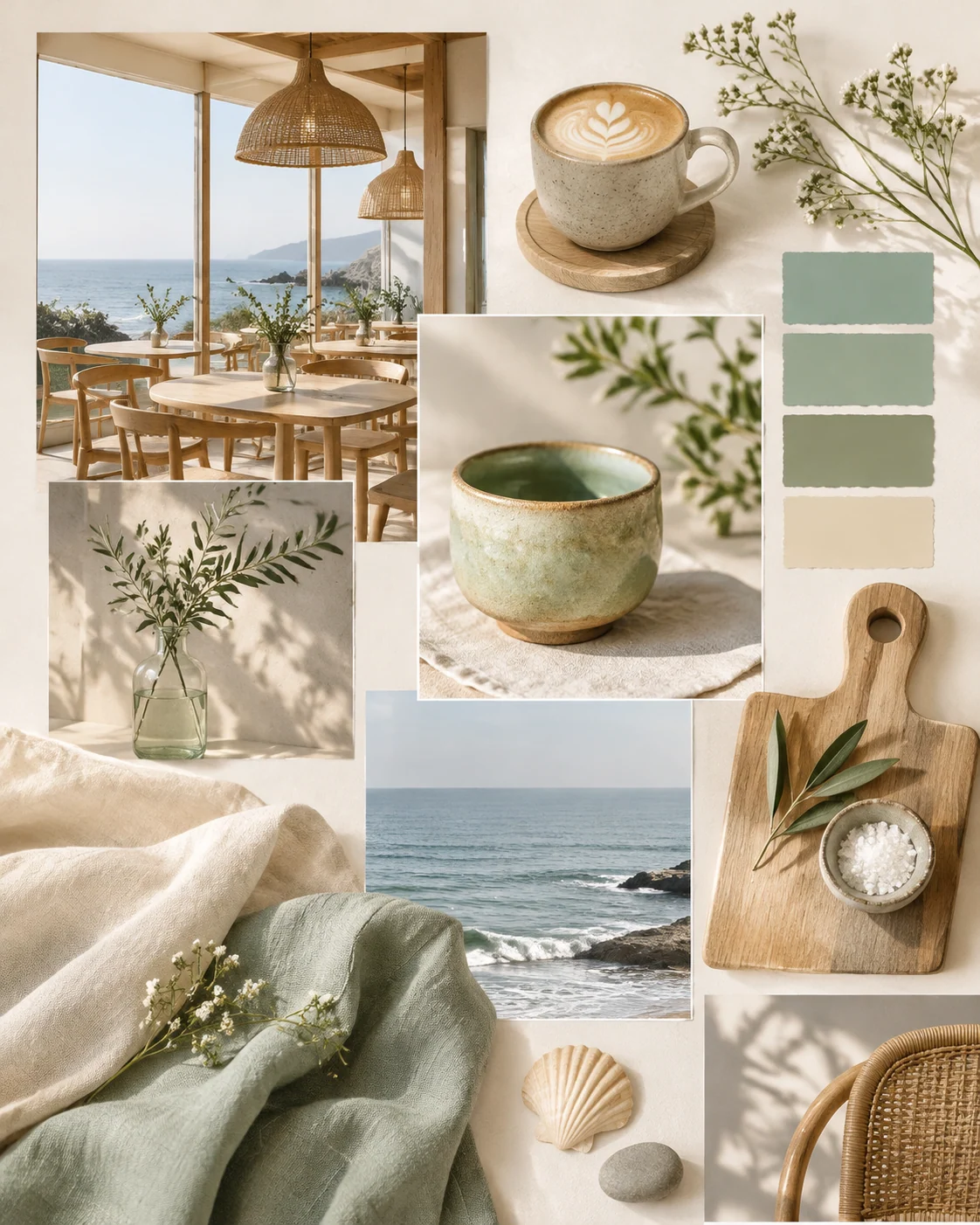
Bring a visual direction onto one mood board

Describe the colors, materials, and feeling you want to explore. Generate one collage-style image that brings textures, objects, and visual references into a coherent direction.

3 free signup credits · No card neededExplore the directions
Fictional café mood board demonstration combining linen, pale oak, ceramic cups, and sea-glass green swatches
MADE WITH FAYVORO · Created with Fayvoro from the prompt below. This is an original demonstration, not a customer example.
A FEW WAYS IN

Explore the example. Make it yours.

Open a prompt to see the starting idea.
You choose when to generate.

Fictional café mood board demonstration combining linen, pale oak, ceramic cups, and sea-glass green swatches
MADE WITH FAYVORO

Fictional coastal café mood board demo

Created with Fayvoro from the prompt below. This is an original demonstration, not a customer example.

Explore the prompt

Create a cohesive editorial mood board for a quiet coastal café concept. Arrange cream linen, pale oak, handmade ceramic cups, sea-glass green color swatches, soft morning light, and small botanical details in a balanced overhead collage. Natural tactile materials, varied image sizes, generous breathing room. No words, letters, brand marks, or readable labels.

MAKE IT MORE YOURS

A little intention. A different image.

01

Name the project and the feeling

A useful mood board connects an atmosphere to a real project. Instead of asking for something beautiful, describe a quiet coastal café, a playful outdoor collection, or a warm reading room. Add three or four visual anchors, such as pale timber, woven linen, soft morning light, and green accents. Those choices give the collage a consistent reason to belong together.

02

Balance references with breathing room

A board can combine material close-ups, objects, color swatches, and a wider scene. Varying their scale helps one element lead while the others support it. Ask for an overhead collage or an editorial grid depending on the presentation you want. Avoid filling every gap: some open space makes the texture and palette easier to discuss with another person. Consistent lighting also helps the different references feel connected.

03

Turn the board into a clearer brief

Use the result to identify what you like about the direction: the lighting, surface finish, color relationship, or level of contrast. The board is one generated image, so its objects are visual suggestions rather than linked products. Record exact material names, supplier references, and brand color values separately when you move from atmosphere to purchasing or a final design system.

BEFORE YOU BEGIN

A few useful answers.

Can I use it for an interior, fashion, or brand project?+

Yes. Name the project and describe its palette, materials, shapes, and mood. Focus each board on one direction so the result is easier to evaluate.

Are the products on the board available to buy?+

The objects are AI-generated visual suggestions. They are not a shoppable catalogue, verified product listing, or supplier recommendation.

Can I extract exact brand colors from the image?+

You can sample approximate colors for discussion, but a generated swatch does not define an exact production value. Set your final color codes separately.

Can I rearrange the items after generation?+

The result is a flattened collage image. To change its internal layout, generate a revision or use an image editor; the items are not independent board elements.

THE NEXT IMAGE COULD BE YOURS

Follow the idea.